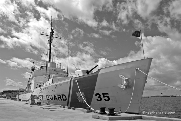
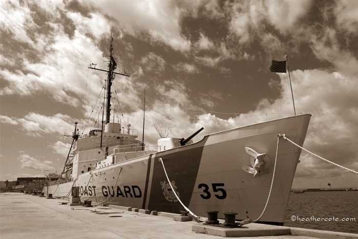
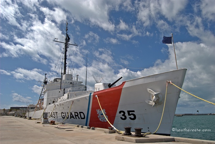
one of each…
I must say, I”m liking the black & white more and more, maybe because I’m finding photos that work? This ship is at Key West…near Fort Zachary Park…for the last few years there was an older Naval vessel docked there, one that was used as a museum… this year the Coast Guard claimed the spot.
There you have it, black & white, sepia, and the original…I’m actually liking the sepia that has been desaturated slightly.

I think all three can stand as good versions of the Image .Well done Heather.
May 11, 2013 at 5:38 pm
Excellent 🙂
May 12, 2013 at 4:17 am
thank you 🙂
May 12, 2013 at 1:57 pm
I actually like the colour one our of the three as the contrast between the grays and the blues really make it for me and are a little washed out when converted to black and white. Nice composition with leading lines and the horizon sits nicely. Great capture.
May 12, 2013 at 8:17 am
thanks for the explanation Ben…helps me to learn…I’m thinking the b & w could be darkened/deepened in certain areas with a more advance photo editor..Photoscape deepens/darkens the whole photo, which doesn’t always work…regardless it is interesting seeing the different outcomes…
May 12, 2013 at 2:06 pm
Heather, I also like the sepia one the best; however, they all look good.
Blessings ~ Wendy
May 14, 2013 at 1:12 am